Responsive Checkout Redesign
Redesigning and streamlining the purchasing process for one of the most loved UK retailers.
Role: Lead UX Designer | Team: Myself, 1 user researcher, 1 visual designer, 1 Product Owner, 4 Developers, 1 QA tester
Key outcomes
- +4% overall checkout conversion (even higher on mobile/tablet)
- +8% mobile app checkout conversion
- –30s average checkout completion time
Summary
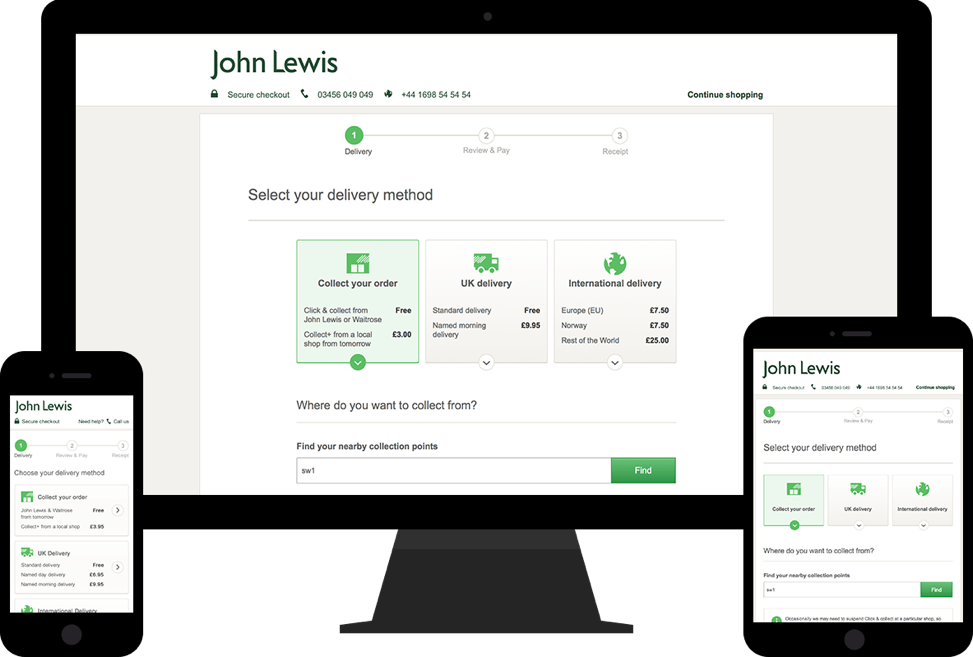
Led the complete redesign of the johnlewis.com checkout to make it fully responsive across all screensize, reduce unnessecary steps and optimise the experience for touch devices to increase conversion.
Problem statement
The John Lewis checkout was built for desktop and relied on a third party to adapt it for mobile devices. It wasn’t optimised for touch and created ongoing maintenance overheads.
Our goal was to create a single, responsive, and streamlined checkout to improve operational efficiency, usability, and conversion.
Project Objectives
- Create an online checkout that fully responsive for all screensiszes
- Optimise and simplify the checkout journey for customers
- Reduce the steps and information the customer needs to checkout
- Improve checkout conversion (particularly on touch devices)
- Increase percentage of signed in checkout purchases
My Process
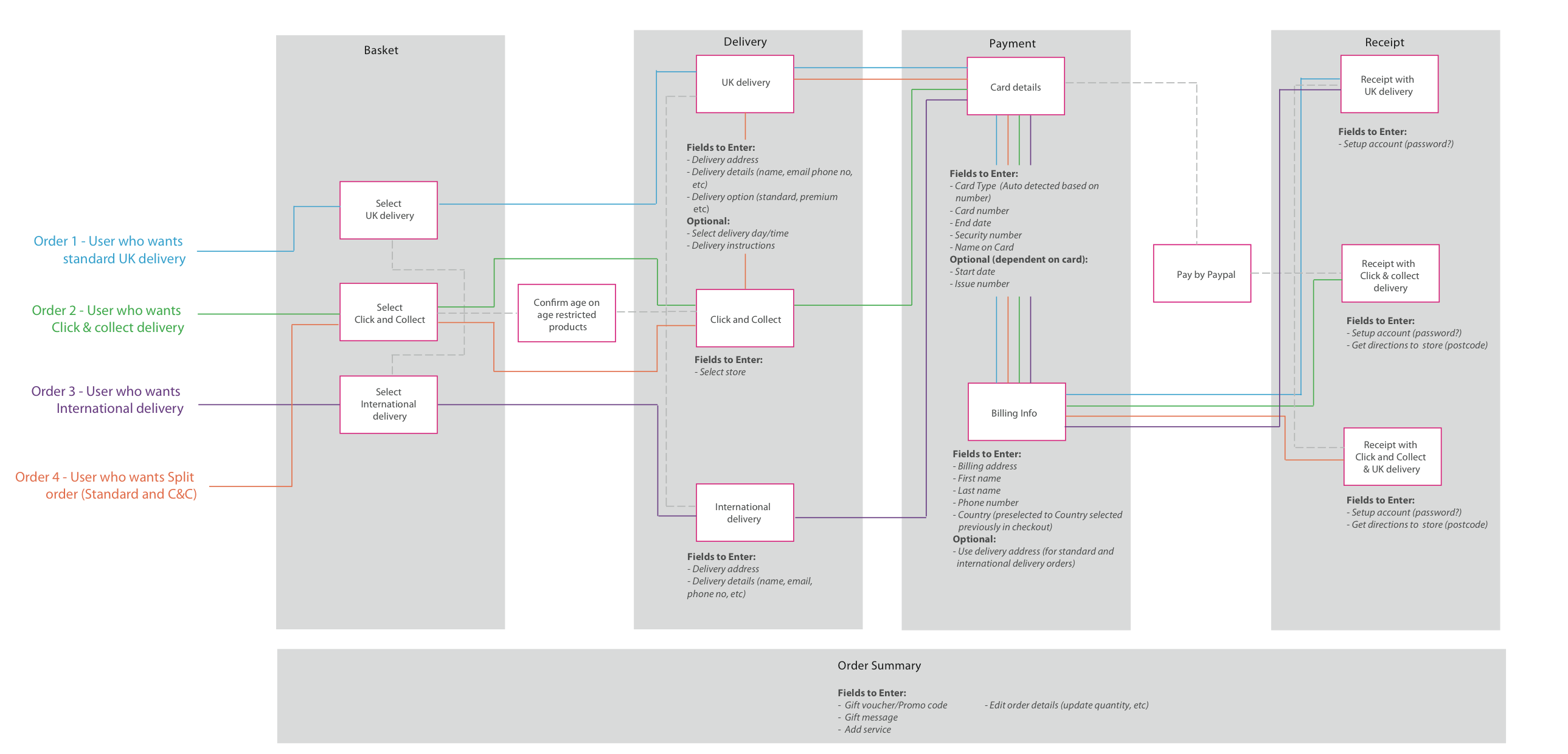
Scenario mapping
Due to the number of different product types and delivery options available John Lewis offer, it was important to outline all possible scenarios to ensure we had all based covered and considered.
Product canvas
I worked closely with the UX Researcher on the project to introduce the product canvas to the team. The canvas was a great multi-purpose tool to make sure our research findings and designs were always visible to the team.
It evolved throughout the project to contain business requirements, highlight risks and was generally a great way to communicate progress to stakeholders and collaborate with other members of the scrum team.
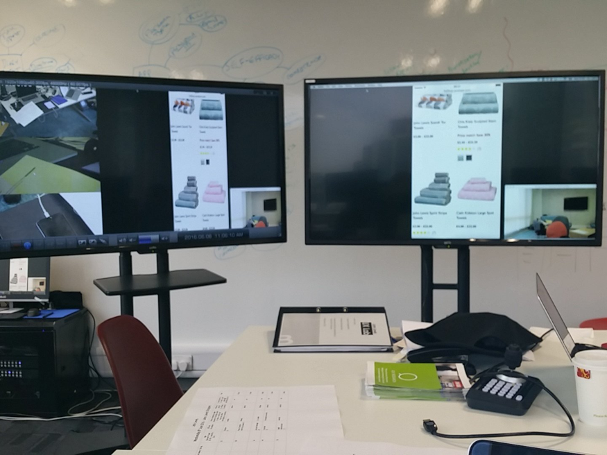
Usability testing
Working closely with the UX researcher, we ran user testing sessions every 2 weeks to:
- Test the initial design concept prototypes
- Validate more detailed designs as we progressed through the project.
- Get customer feeback early and often, allowing us to iterate designs before they were built
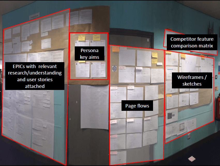
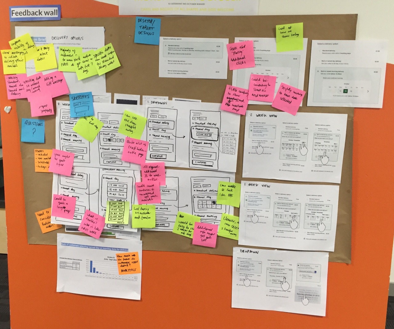
Critique / feedback walls
I introduced a feedback wall that was used for informal design critiques with the team and get the team's input
It typically contained a mini design brief, findings from user research and current status on designs (from initial sketches to more polished visual designs).
Documentation
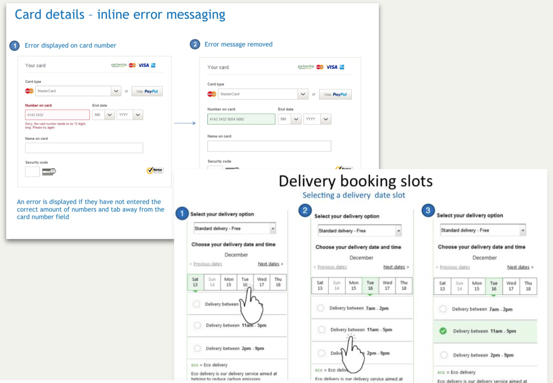
Created lightweight documentation of use cases and scenarios for implementation/testing, plus visual storyboards for planning and estimation sessions.
What I learnt and enjoyed
- I learnt about the importance of having a solid structure and foundation to build on upfront to help mitigate problems or dependencies happening later down the line
- I really enjoyed the collaborative approach to working with the team and introducing new techniques such as design critiques, pair designing and show and tells with different projects.
- Towards the end of the project, I spent a few months as the Product Owner which helped me better understand the importance of balancing business value and user needs when prioritising work